Showing posts with label drawing. Show all posts

Wednesday, 3 February 2016

We’ll Meet Again (*)

Sadly, my lovely grandad died on Sunday 27th December 2015 after a painful and prolonged struggle with cancer. I was determined that he should have an illustration on his Order of Service booklet that reflected his personality and love of nature.
 
The final illustration for his Order of Service uses old and new drawings taken from my sketchbook. My favourite illustrations have been collaged together into a colourful wreath using Adobe Illustrator and Photoshop. Each image represents his interests or the idea of remembrance.

Rosemary is a traditional herb used in funerals as a symbol of remembrance and memories of loved ones.

Pansies were grandad's favourite flower and symbolise loving thoughts. Forget me nots mean 'remember me forever' and symbolise love.

Two birds are jauntily perched at the top of the wreath as he adored them. The robin was a frequent visitor and could be seen following him around when he was busy working in the garden.

The text is taken from grandad's handwriting. This is particularly poignant as when I went away to university, grandad wrote to me at least twice a month. This continued up until his first admission to hospital in October 2015. I've treasured each and every letter that he sent me. They are all over my house in little bundles, there's even a few boxes of them in the loft.

I've loved the detailing of our everyday lives in the letters ranging from the weather and worries to jobs and children. They document how much our lives have changed over the years. Some of my favourite letters are from when I lived in Japan. I think grandad struggled to get to grips with my address in Tokoname as it is different on each envelope, although his letters always found their way to my little flat there.
I feel very sad that our letter writing is at an end. It would take a lot of paper and ink to thank both my grandparents for so many beautiful memories. They have been my anchor, my constant in an ever changing world. For now, I'll look at the birds eating the juicy bright red berries on the berberis shrub outside my kitchen window and be reminded of all the happy times that we spent together.

(*): We'll Meet Again - Vera Lynn

We'll meet again
Don't know where
Don't know when
But I know we'll meet again some sunny day
Keep smiling through
Just like you always do
'Till the blue skies drive the dark clouds far away

So will you please say hello
To the folks that I know
Tell them I won't be long
They'll be happy to know
That as you saw me go
I was singing this song…


Friday, 12 April 2013

Feathered Friends: Eden Project's Rainforest Robin

It is no secret that I love birds and in particular robins. I like hearing their bird song early in the morning on the way to work and unexpected encounters with them whilst out and about. They lift my spirits on the dreariest of days. Initially, I hesitated to include birds in my work as there are lots of artists who use their imagery. However, I think that you have to be true to what inspires you and initial sketches can lead to all sorts of different outcomes as you can see here.

Meet the Eden Project’s Rainforest Biome Robin.
I first came across this friendly little robin in late August 2011 in one of the hottest parts of the Rainforest Biome on a beautiful sunny day (remember those?). I was really surprised to see him hopping around in there as we all associate robins with cold winter days. Maybe this one had come to its senses and realised that the sunny, hot climes were much more appealing? When I visited a year later he was still there and must have found that the biome suited him very nicely!
The images above represent how much this one robin inspired my work and has formed an important part of my Curious Clare image (see above banner!). The painted robin study in my sketchbook has led to digital illustration, relief ceramic tiles and laser cut details on my wedding stationery and bunting. It also highlights the importance I place on drawing when embarking upon new projects!

Tuesday, 19 February 2013

Flyer design - Vintage Afternoon Teas


Earlier this year, I was delighted to be contacted by Gwyneth Brock, founder and owner of Vintage Afternoon Teas to discuss designing a new flyer to promote her business. The design brief specified the inclusion of homemade cakes, oozing with delicious fillings and the importance of using vintage china (as the hire of china is one of the services that the business offers).

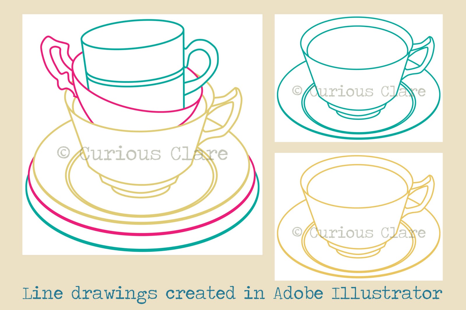
My design work for the flyer started off with a series of photographs. I am fortunate to own several items of vintage china that belonged to my great grandparents and was lent various cake stands by teaching colleagues. I played around with different ways of arranging and stacking the china before settling on the two images that you can see below.
As Gwyneth wanted a ‘clean’ design style, I decided to create crisp line drawings in Adobe Illustrator. I could then experiment with applying pattern and colour in Adobe Photoshop. The patterns that you can see in the designs started off as scans of various papers and fabrics that I have collected over the years. Colours were changed and areas cropped out to make them more unique to the flyer design.
Surprisingly, the cake proved to be the most problematic area of the design. It was vital to convey the scrumptious nature of the cakes that Gwyneth makes. Although the initial designs complete with ‘button’ fruit look delicious I felt that they were lacking the ‘wow’ factor. Gwyneth specified that the cake should look homemade and have fillings oozing out of it. After several re-workings of the cake illustration (including scanning a car sponge for the cake texture!), I decided upon a two tier cake with fat fresh strawberries on the top instead of buttons.
 The final image went through several layout experiments in Adobe Illustrator in order to accommodate Gwyneth’s colour preferences and font choices. I initially used Giddyup Standard, Segoe Script and Poor Richard fonts until I discovered Gwyneth’s love of typewriter text. The final design uses Cooper Black and Courier New which has been ‘aged’ in Adobe Photoshop (good tutorial here). The font colour is teal (or more specifically Focoltone 2258). The final design (see top of page) looks effective on different sizes and will hopefully attract lots of new custom for Gwyneth!


Monday, 17 September 2012

The Built Environment

Featured here are various contemporary artists who have studied the 'built environment'. The artists, ranging from illustrators to surface pattern designers, work in a linear or graphic drawing style and have used block colours in a considered manner. The artists work in different, exciting and inspirational ways that take account of their own personal reactions to their observed environments.
Alice Melvin - Illustrator and Designer who uses line, intricate pattern and flat pretty colour in her work
Jessica Hogarth - Illustrator and Surface Pattern Designer with a focus on line and vibrant block colours
Eve Broadhurst - Textiles Artist and Illustrator with a graphic style and a love of soft pastel palettes
a-side studio -  Graphic designers using a bold, graphic illustration for the new Heartlands heritage site in Cornwall


Robert Samuel Hanson - Illustrator with a love of vibrant colour and geometric shapes. I love the contrast of black, silhouette like buildings with bright splashes of coloured shapes to pick out details.
Neil Dimelow - Architect, teacher and artist with an energetic line drawing style and use of earthy pastel shades