
Earlier this year, I was delighted to be contacted by
Gwyneth Brock, founder and owner of Vintage Afternoon Teas to discuss designing
a new flyer to promote her business. The design brief specified the inclusion
of homemade cakes, oozing with delicious fillings and the importance of using
vintage china (as the hire of china is one of the services that the business
offers).

My design work for the flyer started off with a series of
photographs. I am fortunate to own several items of vintage china that belonged
to my great grandparents and was lent various cake stands by teaching
colleagues. I played around with different ways of arranging and stacking the
china before settling on the two images that you can see below.

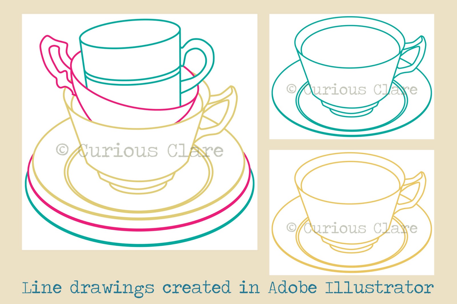
As Gwyneth wanted a ‘clean’ design style, I decided to
create crisp line drawings in Adobe Illustrator. I could then experiment with
applying pattern and colour in Adobe Photoshop. The patterns that you can see
in the designs started off as scans of various papers and fabrics that I have
collected over the years. Colours were changed and areas cropped out to make
them more unique to the flyer design.


Surprisingly, the cake proved to be the most problematic
area of the design. It was vital to convey the scrumptious nature of the cakes
that Gwyneth makes. Although the initial designs complete with ‘button’ fruit
look delicious I felt that they were lacking the ‘wow’ factor. Gwyneth specified
that the cake should look homemade and have fillings oozing out of it. After
several re-workings of the cake illustration (including scanning a car sponge
for the cake texture!), I decided upon a two tier cake with fat fresh
strawberries on the top instead of buttons.


The final image went through several layout experiments in
Adobe Illustrator in order to accommodate Gwyneth’s colour preferences and font
choices. I initially used Giddyup Standard, Segoe Script and Poor Richard fonts
until I discovered Gwyneth’s love of typewriter text. The final design uses
Cooper Black and Courier New which has been ‘aged’ in Adobe Photoshop (good tutorial here). The font colour is teal (or more specifically Focoltone 2258).
The final design (see top of page) looks effective on different sizes and will
hopefully attract lots of new custom for Gwyneth!


