Showing posts with label collage. Show all posts

Saturday, 9 March 2013

Fabric Transfer Paint Tutorial

1. Apply Berol Fabric Transfer Paint (or an alternative brand) onto thin paper such as newsprint or cheap printer paper. Start off by experimenting with the paint application itself. You can apply the transfer paint with a sponge for large block areas of colour or use a paintbrush for areas of detail. You could even use a calligraphy dip pen for fine lines.

2. After you have let the paint dry on the paper, you will need to investigate how the colours transfer on to different fabrics. Man-made fabrics with a sheen take the colour best, although you can use natural, light weight fabrics too. Cut up the colours into small shapes and place paint side down on to a piece of fabric.
3. Sandwich the fabric and paper shapes between a piece of greaseproof paper, place inside the heat press (which needs to be switched on 10 minutes before use) and close the lid. If you do not have access to a heat press, you can dry iron over the top of the greaseproof paper. In order to dry iron, you will need to remove the water from the iron and switch the steam setting off. Take care not to move the paper whilst ironing otherwise you will end up with a ghost print next to your image.
4. The longer you leave the greaseproof paper sandwich under the heat, the more vibrant the colours will be. You will need to take care not to burn delicate fabrics by leaving them under the heat for too long. Natural fabrics will need longer under the heat and the colours will be less vibrant. It is advisable to experiment with temperature settings to achieve desirable results. It should be noted that the heating process also seals the paint on to the surface of the fabric. Let the paper and fabric cool down before inspecting your work!
5. Once you are happy with the colour tests you are ready to create a fabric transfer design. In this project, students took buildings as their inspiration. Students painted a range of colours (some were mixed together to create a wider colour palette) onto paper before carefully cutting and collaging them on to a thin paper background. Note that students used glue sticks sparingly when collaging, as the glue itself reacts with the heat and can leave blotchy effects on the fabric. 

Students in this particular project were producing fabric swatches for a design brief but other applications for this technique could range from tote bags to t-shirt designs. The fabric transfer paint technique is really good fun and produces great results. The main advantage of it is that you can quickly transfer imagery onto fabric in a low tech way using easily accessible equipment that can be found around the home.

I have been exploring this technique further with Kiran Lee on her 'Table Top Textiles' course at Hot Bed Press ready to use with Key Stage 3 students. Watch this space!
 

Tuesday, 19 February 2013

Flyer design - Vintage Afternoon Teas


Earlier this year, I was delighted to be contacted by Gwyneth Brock, founder and owner of Vintage Afternoon Teas to discuss designing a new flyer to promote her business. The design brief specified the inclusion of homemade cakes, oozing with delicious fillings and the importance of using vintage china (as the hire of china is one of the services that the business offers).

My design work for the flyer started off with a series of photographs. I am fortunate to own several items of vintage china that belonged to my great grandparents and was lent various cake stands by teaching colleagues. I played around with different ways of arranging and stacking the china before settling on the two images that you can see below.
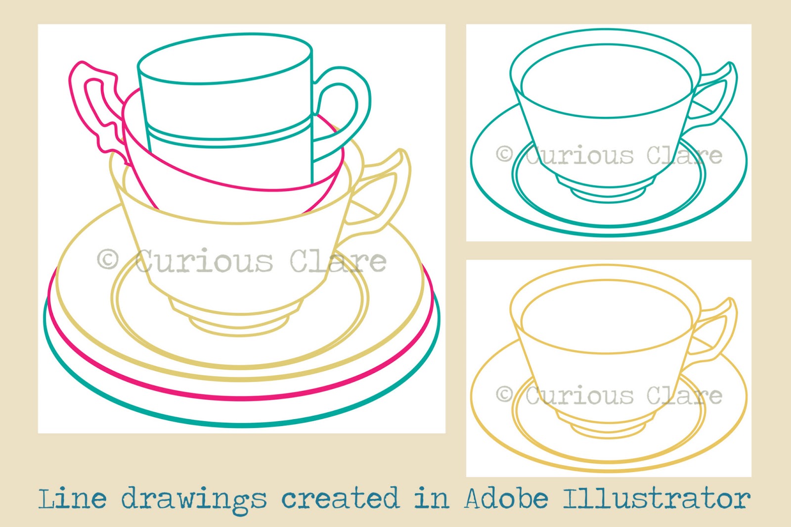
As Gwyneth wanted a ‘clean’ design style, I decided to create crisp line drawings in Adobe Illustrator. I could then experiment with applying pattern and colour in Adobe Photoshop. The patterns that you can see in the designs started off as scans of various papers and fabrics that I have collected over the years. Colours were changed and areas cropped out to make them more unique to the flyer design.
Surprisingly, the cake proved to be the most problematic area of the design. It was vital to convey the scrumptious nature of the cakes that Gwyneth makes. Although the initial designs complete with ‘button’ fruit look delicious I felt that they were lacking the ‘wow’ factor. Gwyneth specified that the cake should look homemade and have fillings oozing out of it. After several re-workings of the cake illustration (including scanning a car sponge for the cake texture!), I decided upon a two tier cake with fat fresh strawberries on the top instead of buttons.
 The final image went through several layout experiments in Adobe Illustrator in order to accommodate Gwyneth’s colour preferences and font choices. I initially used Giddyup Standard, Segoe Script and Poor Richard fonts until I discovered Gwyneth’s love of typewriter text. The final design uses Cooper Black and Courier New which has been ‘aged’ in Adobe Photoshop (good tutorial here). The font colour is teal (or more specifically Focoltone 2258). The final design (see top of page) looks effective on different sizes and will hopefully attract lots of new custom for Gwyneth!


Sunday, 30 December 2012

Happy New Year!


Happy new year to you all! I’ve been playing around with collage and hand drawn text to create a new year’s design. Various hand stained papers layered with stripes of gorgeous washi tape have been cut out with different sized paper stamps. I have then played around with the colours in Adobe Photoshop to create the final design. My favourite is the dark plum coloured version.

2012 has been a fantastic year and I’m now looking forward to the new adventures that 2013 will bring (especially in my lovely new studio)!

Saturday, 29 September 2012

Built Environment - Mood Boards Tutorial

This post offers advice about how to create a mood board (also known as an inspiration board). Mood boards help creative people, from fashion designers to jewellers, to start putting together ideas for a project or commission. They are a collection of photographs, drawings, notes, samples and swatches placed creatively to communicate your ideas and interests.

Mood board inspiration from decor8


The most important reason behind constructing a mood board is to focus your thoughts. This can be done by really thinking about the theme of your project and then gathering items that will help you to visualise it. You can find inspiration in many different places ranging from the paint department at your local DIY shop and haberdashers to magazines and the internet. You can often find inspiration in your own home – raid those cluttered drawers and forgotten boxes in the garage! I often photograph things and places that interest me on my phone to use at a later date.

The mood boards on this post concentrate on two of the artists’ featured in my first post and the Built Environment 1 board on Pinterest.

Eve Broadhurst’s colour scheme for her ‘Belgium from the Rooftops’ set of illustrations uses pretty pastel colours reminiscent of ice cream and lollies. I have put together a collection of objects on Pinterest called ‘Ice Cream and Lollies’ that describes the colour theme and captures the atmosphere of her illustrations.


It is important to think about the theme creatively and not just focus on finding images of ice cream or lollies. In this photograph, I have gathered together objects ranging from a vintage cotton reel and old buttons to modern day washi tape. The objects all reflect the colour scheme that Eve has used and the one that I would like to use on a mood board inspired by her work. I have then placed the items on an old tablecloth that my grandma hand embroidered. I have also photographed pastel sweets on a white background. The photographs shown here could be used to add extra interest to your mood board.

Jessica Hogarth and a-side studio’s illustration uses areas of bright, block colour. Their designs remind me of confectionery and I have put together a board on Pinterest called ‘Sweetie Brights’ that is inspired by their work. Here, visual interest ranges from boiled sweets to stacks of coloured pencils.
Finally, make sure that you are inspired by the items that you are placing on your mood board. Be sparing with the use of text, take care over the composition and use samples to create additional interest (such as buttons, or scrabble piece or ribbon). Most of all, have fun putting it all together!

 Examples of two pupils' mood boards inspired by Ice Cream and Lollies

 Examples of two pupils' mood boards inspired by Sweetie Brights