Saturday, 9 March 2013

Fabric Transfer Paint Tutorial

1. Apply Berol Fabric Transfer Paint (or an alternative brand) onto thin paper such as newsprint or cheap printer paper. Start off by experimenting with the paint application itself. You can apply the transfer paint with a sponge for large block areas of colour or use a paintbrush for areas of detail. You could even use a calligraphy dip pen for fine lines.

2. After you have let the paint dry on the paper, you will need to investigate how the colours transfer on to different fabrics. Man-made fabrics with a sheen take the colour best, although you can use natural, light weight fabrics too. Cut up the colours into small shapes and place paint side down on to a piece of fabric.
3. Sandwich the fabric and paper shapes between a piece of greaseproof paper, place inside the heat press (which needs to be switched on 10 minutes before use) and close the lid. If you do not have access to a heat press, you can dry iron over the top of the greaseproof paper. In order to dry iron, you will need to remove the water from the iron and switch the steam setting off. Take care not to move the paper whilst ironing otherwise you will end up with a ghost print next to your image.
4. The longer you leave the greaseproof paper sandwich under the heat, the more vibrant the colours will be. You will need to take care not to burn delicate fabrics by leaving them under the heat for too long. Natural fabrics will need longer under the heat and the colours will be less vibrant. It is advisable to experiment with temperature settings to achieve desirable results. It should be noted that the heating process also seals the paint on to the surface of the fabric. Let the paper and fabric cool down before inspecting your work!
5. Once you are happy with the colour tests you are ready to create a fabric transfer design. In this project, students took buildings as their inspiration. Students painted a range of colours (some were mixed together to create a wider colour palette) onto paper before carefully cutting and collaging them on to a thin paper background. Note that students used glue sticks sparingly when collaging, as the glue itself reacts with the heat and can leave blotchy effects on the fabric. 
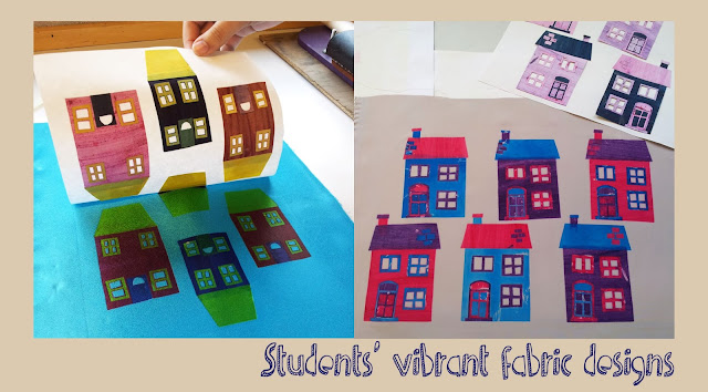
Students in this particular project were producing fabric swatches for a design brief but other applications for this technique could range from tote bags to t-shirt designs. The fabric transfer paint technique is really good fun and produces great results. The main advantage of it is that you can quickly transfer imagery onto fabric in a low tech way using easily accessible equipment that can be found around the home.

I have been exploring this technique further with Kiran Lee on her 'Table Top Textiles' course at Hot Bed Press ready to use with Key Stage 3 students. Watch this space!
 

Monday, 4 March 2013

Sally Falkner’s Creature Workshop

It is always a pleasure to return to Nottinghamshire, especially when I am visiting the beautiful Hope and Elvis studio run by Louise Presley. The purpose of my trip on Saturday 2nd February was to take part in a workshop with the lovely Sally Falkner. Sally is an interesting character, not only is she an artist but she also practises as a therapist and social worker. These experiences really shine through in the tiny, nostalgic creatures that she makes. Each one of Sally’s creatures has its own intriguing story to tell. This is partly due to the vintage cloth that they are made from and partly from the real life narratives that Sally weaves into her work.

Sally states that she uses the “traditional toy making method of winding wire onto a frame.” Initially she models a wire frame for the creature. This is then followed by wrapping the ‘body’ with wool and later cloth to add form. The head is made from old blankets which are stitched together, stuffed and joined to the body. The ears help to keep the structure of the body in place and add character. The creatures evolve through the making process and are led by Sally’s experiences and also her current treasured finds from car boot sales or charity shops.

As a lover of our feathered friends, I had set my heart on making a bird like creature under the guidance of Sally. I found the experience of creating without producing initial drawings quite interesting, as it allowed me to play more freely with the materials on offer. I was really surprised that my creature started to take on the form of a goose as I had imagined that I would create a smaller and more delicate bird. I was also drawn to the muted colours of old lace and doilies instead of the bright, patterned cloths that I would normally use. 

I have to confess that I have yet to complete my creature. I have progressed to making an apron from a vintage tablecloth for the goose. I am particularly pleased with the crocheted ‘frill’ at the bottom of the apron. I made this by adapting a crochet rose pattern given to me by Jo Johnson at French Knots Craft Studio. I am hoping to finish off my creature with a hat and shoes before giving her away to my mum who seemed quite taken with her!

I was impressed with all the different creatures that people made and the fantastic accessorising that went on. Two of my favourites can be seen below. I love the land girl feel of the creature on the suitcase and the gorgeous hand knitted cardigan of the character on the bed made by Anne of Angel Eden. I think that it is fair to say that everyone invested their own stories and personalities into their creatures.

Thanks Sally and Louise for an enjoyable and busy crafting day!


Sunday, 3 March 2013

Upcycled Jam Jar Tutorial


-Several clean jam jars with labels and sticky residue removed

-Spray paint (I used Plasti-kote Fast Dry enamel in Sky Blue & Hot Pink from B&Q)

-Plastic toys – new or discarded!

-Strong adhesive  (Araldite works best)

-Plastic carrier bags – cheap thin ones are the most suitable

-Protective sheeting or newspaper

-Good ventilation!

-Apron to protect clothing


1. Eat lots of delicious jam or chutney.

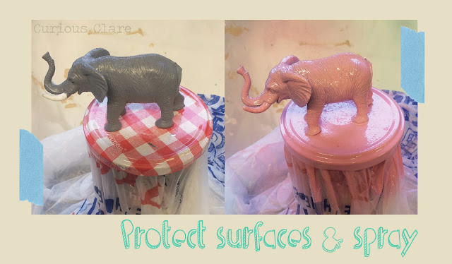
2. Soak empty jars in hot soapy water to remove labels. Use nivea and a J cloth to remove the sticky residue (tip from my grandma!). If you do not remove the stickiness you will be left with a rough surface when you apply the spray paint.


3. Glue plastic toy to the jam jar lid using a strong adhesive such as araldite.
4. When dry, put a plastic carrier bag over the glass part of the jam jar and screw the lid shut.

5. Put on an apron and cover your work surface with newspaper or protective sheeting.


6. In a well ventilated area, spray the lid with an even layer of spray paint. You may need to apply several coats to larger toys. It is advisable to wait for each layer to dry before applying new coats of spray paint.
7. When the lid is completely dry remove the plastic carrier bag and fill. I filled mine with ribbon and wires that were cluttering up a drawer. 
8. Screw on lid and admire your handiwork! 
I would like to say that I do not take any credit for this idea. I spotted Torie Jayne’s Bunny Jars last autumn on Pinterest and pinned them to my Studio Envy board for future use. I was pleased to find another use for the many Bonne Maman jam jars that I had collected for my wedding table flower arrangements!
Wedding photography by Kelly Clarke of Imagesplash


Tuesday, 19 February 2013

Flyer design - Vintage Afternoon Teas


Earlier this year, I was delighted to be contacted by Gwyneth Brock, founder and owner of Vintage Afternoon Teas to discuss designing a new flyer to promote her business. The design brief specified the inclusion of homemade cakes, oozing with delicious fillings and the importance of using vintage china (as the hire of china is one of the services that the business offers).

My design work for the flyer started off with a series of photographs. I am fortunate to own several items of vintage china that belonged to my great grandparents and was lent various cake stands by teaching colleagues. I played around with different ways of arranging and stacking the china before settling on the two images that you can see below.
As Gwyneth wanted a ‘clean’ design style, I decided to create crisp line drawings in Adobe Illustrator. I could then experiment with applying pattern and colour in Adobe Photoshop. The patterns that you can see in the designs started off as scans of various papers and fabrics that I have collected over the years. Colours were changed and areas cropped out to make them more unique to the flyer design.
Surprisingly, the cake proved to be the most problematic area of the design. It was vital to convey the scrumptious nature of the cakes that Gwyneth makes. Although the initial designs complete with ‘button’ fruit look delicious I felt that they were lacking the ‘wow’ factor. Gwyneth specified that the cake should look homemade and have fillings oozing out of it. After several re-workings of the cake illustration (including scanning a car sponge for the cake texture!), I decided upon a two tier cake with fat fresh strawberries on the top instead of buttons.
 The final image went through several layout experiments in Adobe Illustrator in order to accommodate Gwyneth’s colour preferences and font choices. I initially used Giddyup Standard, Segoe Script and Poor Richard fonts until I discovered Gwyneth’s love of typewriter text. The final design uses Cooper Black and Courier New which has been ‘aged’ in Adobe Photoshop (good tutorial here). The font colour is teal (or more specifically Focoltone 2258). The final design (see top of page) looks effective on different sizes and will hopefully attract lots of new custom for Gwyneth!


Monday, 4 February 2013

French Knots Studio - Crochet


Ever since my grandma taught me how to crochet simple flowers several years ago, I have had an urge to learn more about the craft. As she doesn’t live on my doorstep, I was determined to find a local course that would help me to make them again. Coincidentally, French Knots Studio in Sale offers courses in crafts ranging from stitch to crochet. 
Jo, the owner of French Knots Studio has transformed a brick outhouse at the bottom of her garden into a stylish yet homely haven and it is here that she runs her classes. The outhouse is beautifully decorated and is stuffed full of pretty textiles ephemera to inspire her students.
Jo has a generous manner and endless patience with her students. She has an obvious love of textiles and this really comes across as she guides you through the making process. The intimate size of her classes means that you get as much help as you need. The small, friendly nature of her studio allows students to chat, share advice, swap stories and munch on delicious biscuits (most important!). 
I’m delighted to say that my confidence with crochet has grown. After three courses I have gained enough skills to make a granny square cushion cover, a star garland and now I’m back full circle to making flowers. I’m not sure what I’ll use the flowers for yet but the most important thing for me is that I am enjoying making them again. Thanks Jo! 
 

Tuesday, 15 January 2013

The First Cut – Students’ Responses

The teacher’s preview evening of ‘The First Cut’ exhibition at Manchester Art Gallery included the opportunity to work with artists Nicola Dale and Andrew Singleton. Initially, the artists gave us an overview of their work to date and afterwards delivered workshops where they shared their secrets with us!
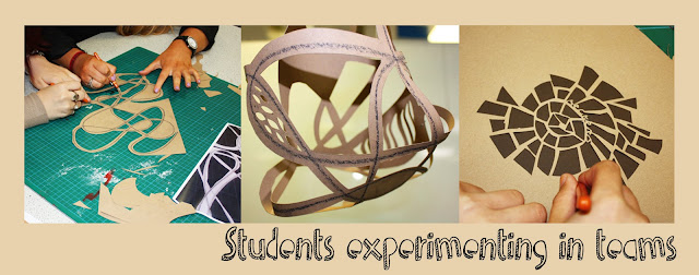
  This proved to be great fun and it was beneficial to us all as educators to be in the position of a learner for a change! I enjoyed the workshops so much that I took the ideas back to school and challenged my Year 12 students to take Nicola and Andrew’s ideas on board. Students were shown the artists’ work and after a demonstration were asked to work in small teams to explore the qualities of paper. 
Students initially experimented with different techniques ranging from piercing and slicing to rolling and wrapping. They were then asked to use the best of their ideas to create a group piece that could be hung in the style of Andrew Singleton. Their homework task was to take an old Manchester Art Gallery guide and create a small sculpture from it, as Nicola had asked us to do during her workshop. They were given the theme of water as the old guide was for a watercolour exhibition. One of the results of this task can be seen below. 
  It is interesting to see that this paper workshop and exhibition are still influencing students today as they work towards their final submission for Unit 3. I look forward to seeing the end results and would like to say a big thank you to Manchester Art Gallery, Nicola and Andrew for delivering such an inspirational session back in July.

Saturday, 5 January 2013

The First Cut

The First Cut exhibition at Manchester Art Gallery is a stunning celebration of artists who use paper in original and exciting ways. There has been a growing trend of artists cutting and sculpting paper over the past few years and this exhibition brings together some of the most important names in one place. 

I was fortunate enough to be invited to a teacher’s preview evening in July where we found out about the concept of the exhibition and worked with two of the exhibiting artists – Nicola Dale and Andrew Singleton. As I am a such a huge fan of cut paper work (whether it has been cut by hand or by laser), it was a real treat to be able to work with Nicola and Andrew. Both artists took time to carefully explain the influences behind their sculptures before showing us their working methods. For me, it is really important to know how a work of art has come about as it places the work in context and becomes much more meaningful.
Watch a short interview with Andrew here
Watch a short interview with Nicola here

Paper sculptures in ‘The First Cut’ are dotted all over Manchester Art Gallery but the main exhibition area is on the top floor where artists have got the advantage of the vast rooms to display their creations. Walking in to the first room, I was immediately greeted with the surreal hanging sculptures of Manabu Hangai. Manabu’s ‘Wonder Forest’ is a series of enormous tree like sculptures that are suspended from the ceiling. As I wandered through his gently moving forest it conjured up feelings of being a child again. Manabu has created the installation from locally sourced branches and autumnal coloured leaves made from Japanese seaweed. The leaves are made from ‘hosojuzumo’ which is a seaweed based raw hemp paper pigment native to Hokkaido, Japan. The leaves have a lovely lace like quality to them and cast beautifully patterned shadows on to the floor as they slowly move around. Magical!

I was also thrilled to see two of my favourite paper artists in the first room, Rob Ryan and Peter Callesen. The scale of both artists’ work surprised me. Rob’s work was cut on a much larger scale than I had imagined it would be and Peter’s work was exceptionally small (being fashioned from a single sheet of A4 paper). It just goes to show the importance of seeing art work first hand (Year 13 take note!)
Claire Brewster has cut birds on display in the main exhibition area and butterflies on the first floor in the Pre-Raphaelites gallery. Here, on the dusky turquoise walls and amongst work of another time, she has pinned exquisitely cut butterflies. Claire has used vintage map paper to create the butterflies which range in size and shape – some look like they are resting whilst others are in flight. I like the reference that she has made here to the Victorian’s act of pinning and classifying nature.

There are many other equally talented and interesting artists in this exhibition – far too many to mention in this post! You can see a great clip of the exhibition installation here. If you are in the area, it is well worth a visit. The exhibition is on at Manchester Art Gallery until Sunday 27th January 2013 before moving on to Djanogly Art Gallery in Nottingham (from April).